|
k
|
|||
| Regel 16: | Regel 16: | ||
== Alternative visualisation == |
== Alternative visualisation == |
||
| − | Replacing the visualisation of this pattern will not be easy, mostly because of the somewhat chaotic relationships that can be found within it. The new visualisation must adhere to at least the following rules: Firstly, the visualisation needs to be clear, even when large amount of contexts and relationships have been defined. Secondly, the visualisation must be capable of conveying a message without going into too much detail |
+ | Replacing the visualisation of this pattern will not be easy, mostly because of the somewhat chaotic relationships that can be found within it. The new visualisation must adhere to at least the following rules: Firstly, the visualisation needs to be clear, even when large amount of contexts and relationships have been defined. Secondly, the visualisation must be capable of conveying a message without going into too much detail; it has to be able to show who is involved in the context and in what way. Lastly, the visualisation must be interactive; one way to remove clutter is to make clever use of filtering, blurring, sharpening, etc. One possible solution is to only show part of the visualization, thus hiding information that might be irrelevant. |
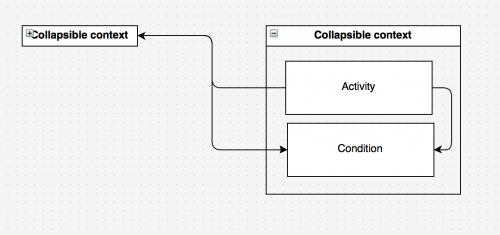
This could be done by allowing the contexts to be collapsed, or by blurring some parts of the image, color could also be used to make a particular part stand out. Practically speaking, this would be filtering the image; note that filtering does not necessarily mean that data is discarded; it is also possible to filter by putting the emphasis on other data. This might increase the amount it takes to grasp the full picture, but at the same time it will prevent information overload. This is a trade-off that will have to be made. In the example below, the content of the contexts has been hidden, allowing the user to see which context has something to do with another context without seeing the details. If more information is needed, then the user can simply 'open up' the context again, showing the details. |
This could be done by allowing the contexts to be collapsed, or by blurring some parts of the image, color could also be used to make a particular part stand out. Practically speaking, this would be filtering the image; note that filtering does not necessarily mean that data is discarded; it is also possible to filter by putting the emphasis on other data. This might increase the amount it takes to grasp the full picture, but at the same time it will prevent information overload. This is a trade-off that will have to be made. In the example below, the content of the contexts has been hidden, allowing the user to see which context has something to do with another context without seeing the details. If more information is needed, then the user can simply 'open up' the context again, showing the details. |
||
Versie van 6 mrt 2014 om 13:16
Eigenschappen
| Context | Expertise Management Method (EMM) |
|---|---|
| prefLabel | Big Picture |
| altLabel | |
| hiddenLabel | |
| inScheme | |
| subject | |
| broader | EMontPatronen |
| narrower | |
| partOf | |
| association | |
| related | |
| creator |
De View-Navigation (VN) pagina's.
Er zijn geen VN pagina's gelinkt.
Description
The Big Picture pattern is used to describe the entirety of a situation, its purpose is to give a bird’s-eye view, the so-called: ‘Big picture’ of a situation. The relevant contexts and sub-contexts are prominent in this pattern, seeing as a context can describe an entire situation without having to go in much detail. Information such the roles, goals, conditions and even organizations can be harbored in a context. The pattern maps the connections between goals, associated roles and certain conditions. They are to be connected because they have an effect on them, whether it’s a positive or negative effect is not relevant in this case.
The PQR formula is widely used within this pattern, PQR is a formula/pattern and has been dubbed as the ‘working horse’ of EMont; it is widely used within the EMont because it captures the notion of cognitive patterns or practices concisely. However, the emphasis in the Big Picture pattern is on the Q part of the PQR formula, considering the course of action is mostly dependent on the context of the situation. How it’s done and why it’s done for is less relevant when approaching the situation at such a high level. Currently, the big picture pattern is being visualised by what's known as a concept map, which is a diagram that shows all the necessary information to show which contexts are involved and what the relationship between the contexts is. A small subset of a concept map is displayed below:
It should be noted that a context could have multiple sub-contexts; these sub-contexts could also have multiple sub-contexts, and so forth. An example of this would be a context with an organization, a sub-context could be a department, and the sub-context of the department could be a specific role. However, a problem with this visualization arises when working with very large data structures where many relationships are defined. Lines will go from one corner of the screen to another, crossing multiple other lines in the process. A few suggestions have been added that might aid in improving the readability of the big picture pattern. For now these suggestions have been isolated, meaning that connections between this pattern and others have not yet been made, this will be done in a later stage.
Alternative visualisation
Replacing the visualisation of this pattern will not be easy, mostly because of the somewhat chaotic relationships that can be found within it. The new visualisation must adhere to at least the following rules: Firstly, the visualisation needs to be clear, even when large amount of contexts and relationships have been defined. Secondly, the visualisation must be capable of conveying a message without going into too much detail; it has to be able to show who is involved in the context and in what way. Lastly, the visualisation must be interactive; one way to remove clutter is to make clever use of filtering, blurring, sharpening, etc. One possible solution is to only show part of the visualization, thus hiding information that might be irrelevant.
This could be done by allowing the contexts to be collapsed, or by blurring some parts of the image, color could also be used to make a particular part stand out. Practically speaking, this would be filtering the image; note that filtering does not necessarily mean that data is discarded; it is also possible to filter by putting the emphasis on other data. This might increase the amount it takes to grasp the full picture, but at the same time it will prevent information overload. This is a trade-off that will have to be made. In the example below, the content of the contexts has been hidden, allowing the user to see which context has something to do with another context without seeing the details. If more information is needed, then the user can simply 'open up' the context again, showing the details.
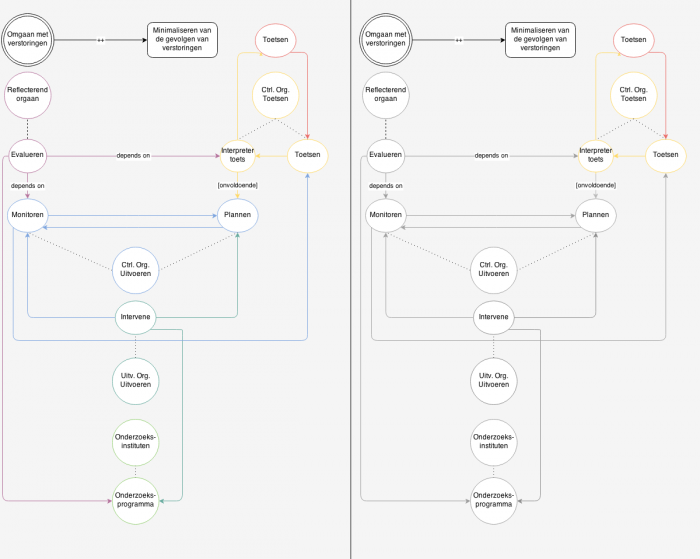
Another option would be to keep the data as it is, but approach it in a completely different way. There are many options for visualizing information, though only a few are appropriate for this kind of data, mostly because there are many intertwining connections. One type of visualizations is a subway map. The halts can be regarded as contexts, while going to the next halt, there will be certain activities that need to take place, which will have an effect on a certain condition, sometimes implicitly. By coloring the lines connected to the context accordingly, it becomes possible to visualize complex structures, while keeping it readable. Here’s a rough sketch:


